Branding is the difference between selling a $4 thing for $30 and racing to the bottom on Amazon. It is also the part most beginners skip, because branding feels expensive and intangible. It is neither. Below is the real six-week process for taking a commodity and turning it into a brand, with the Artur car-towel case as the spine of the example. Anyone with a product and a phone can do this.
What branding actually is
Branding is not a logo. It is not a font. It is the answer, in one sentence, to "why would someone buy this from you instead of the cheaper version next to it".
If you cannot answer that sentence cleanly, you do not have a brand. You have a SKU. The work below is the work of finding and packaging the answer.
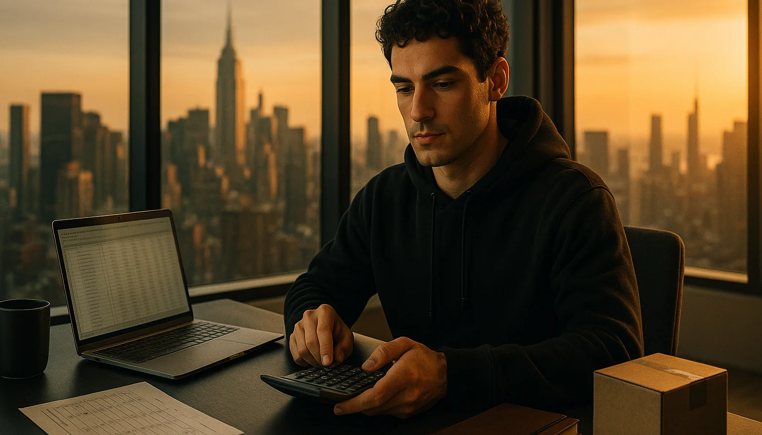
Week 1 - the positioning sentence
Write one sentence that fills in this template:
"[Brand name] is the [product type] for [specific buyer] who wants [specific outcome] without [specific tradeoff]."
Example: "DetailLab is the microfiber drying towel for car enthusiasts who want a professional-finish dry without scratches or water spots."
That sentence is doing a lot of work. It names a buyer, an outcome, and a tradeoff being eliminated. It also implies premium positioning ("professional-finish") and a specific use case ("drying").
Most beginners write something vague like "We make quality car care products". That is not a brand. That is a brochure.
Spend a real week on this sentence. Rewrite it ten times. Try variants. The sentence is the foundation everything else builds on. If the sentence is wrong, everything downstream is wrong.
Week 2 - the name and visual identity
The name should be:
Easy to pronounce and spell. Buyers who cannot type your brand into a search bar cannot find you.
Available as a .com domain. Yes, .com still matters in 2026. The .co or .shop alternative is okay but costs you ~15-30% of brand searches.
Trademarkable. Check USPTO before committing. If the name is descriptive ("Best Car Towel"), the trademark will be refused. If it conflicts with existing marks, ditto.
For the visual identity, the minimum viable set is a logo, a primary brand color, a secondary color, and a typeface. That is it. Brand books with 14 pages of guidelines are nice but not required at the start.
Use a free AI logo generator (Looka, Brandmark, or Canva's logo tool) to get a draft. Then either commit to it or pay a freelance designer $200-$500 to refine. Skip the $5,000 agency unless you are already past $1M in revenue.
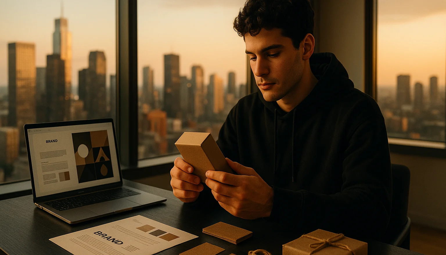
Week 3 - the packaging
This is the week most beginners skip. Do not skip it.
The packaging is the first physical interaction the customer has with your brand. It signals quality before they even open the box. A generic poly bag from an Aliexpress supplier signals "this is a cheap commodity". A printed sleeve, a tissue-paper wrap, or a custom box signals "this brand cares".
The cheapest upgrade that has the biggest effect - printed thank-you cards in the package. About $0.05 per card if you order 500. The card says the brand name, two sentences about who you are, and an invitation to share or review. Doubles repeat-purchase rate for many shops.
Next tier - branded poly mailers or custom printed boxes. $1-$3 per unit at small volumes via Sticker Mule, Noissue, or similar. Worth it for products at $30+ retail.
The Artur car-towel example: he started with the towel in a clear poly bag from the supplier. Then he switched to a brown kraft sleeve with the brand name printed in clean type and a small detailing instructions card inside. Same towel. Buyers behaved as if it was a different product. Reviews started using the word "premium".
Week 4 - the photography
The photography is what your brand actually looks like in customers' eyes, more than any other layer. A great brand with mediocre photos converts worse than a mediocre brand with great photos.
Specific aesthetic decisions to make:
Background. White, marble, wood, linen, kraft, or moody-dark. Pick one and use it across the catalog. The consistency is part of the brand signal.
Light style. Bright and clean, or moody and shadowed. Pick one.
Color grade. Warm or cool. Pick one.
Composition style. Centered, off-centered, flat lay, lifestyle. Pick one or two and rotate.
Detail in how to take product photos at home that sell and Midjourney for e-commerce.
The customer is not buying a $2 thing for $10. They are buying the thing that looked like it was worth $30.
Week 5 - the copy and tone
The brand voice should be consistent across product descriptions, social posts, customer emails, and the about page.
Three voice decisions to make:
Formal or conversational. "We craft these wallets in our workshop" versus "I make these wallets at my workbench". Same fact, very different brand feel.
Confident or modest. "These are the best you can buy" versus "Hope you enjoy them". Most premium brands lean confident. Most artisan brands lean modest. Pick one and commit.
Long-form or short-form. Some brands write 400-word product descriptions full of story. Some write 80-word product descriptions and let the photos do the work. Both work, but mixing them looks inconsistent.
Once you have the voice decided, all your copy gets easier to write because the constraints are clear.
Week 6 - the launch
The branded version of the product launches with intent.
The Shopify or marketplace listing gets the new photos, new description, new packaging mentioned, the brand story page linked.
The brand introductory post on Instagram, TikTok, Pinterest tells the founder story in 3 short paragraphs and shows the product in use.
The first email to your list (if you have one) announces the brand version, with a launch discount or early-access perk.
Ads testing budget moves to the new branded creative. The conversion should be measurably higher than the unbranded version within 30 days.
What changes after the brand is built
Three things tend to happen.
One - conversion rate climbs 30-80% on the same product. Buyers who would have hesitated on the unbranded version commit to the branded one.
Two - the price ceiling rises. The branded version can charge 30-100% more for the same physical product because the perceived value is higher.
Three - repeat purchase rate climbs. Buyers remember your brand and come back. Unbranded products do not produce loyalty.
The Artur towel did all three. Same physical towel. December 2025 - around $10,000 in revenue, 1,900+ units, 4.7/5 across 150+ verified reviews. The product was a commodity. The brand was the lever.
The mistakes to avoid
Spending $5,000 on branding before validating the product. Brand a winner, not a guess.
Branding for "everyone". The sharper the buyer definition, the stronger the brand. "Premium" is not a buyer. "Detailers and car enthusiasts who want professional results at home" is a buyer.
Copying a successful brand's aesthetic too closely. Buyers notice. The point of branding is differentiation, not imitation.
Stopping at the logo. The logo is one element. Packaging, photography, copy, voice - all of them have to align or the brand reads as confused.
For the deeper version on building branded products, read is dropshipping dead in 2026 and how to build a one-product Shopify store. The full branding module in the course walks through this layer in detail. Pick the positioning sentence this week. The rest follows.